Project Name
Bazinga AI
Roles
UX UI Design Brand Identity Web Design/Development
Date
01-2025
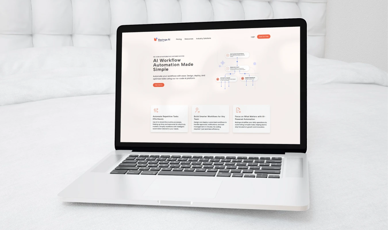
I led the end-to-end design and development of a cutting-edge digital platform, shaping its brand identity, web design, and core user experience. My role encompassed: Brand Identity Development -Crafted a cohesive visual identity, including logo, typography, and color palette, ensuring consistency across all touchpoints. Web Design & Development -Designed and developed the homepage, pricing page, and blog pages, focusing on a seamless, responsive, and engaging user experience. UI/UX Design for AI Assistant Creation Flow – Designed an intuitive and user-friendly interface for building AI assistants, optimizing the workflow for efficiency and ease of use. Through a combination of thoughtful branding, sleek UI/UX, and performant web development, I helped deliver a polished and user-centric digital experience.
Link to live site
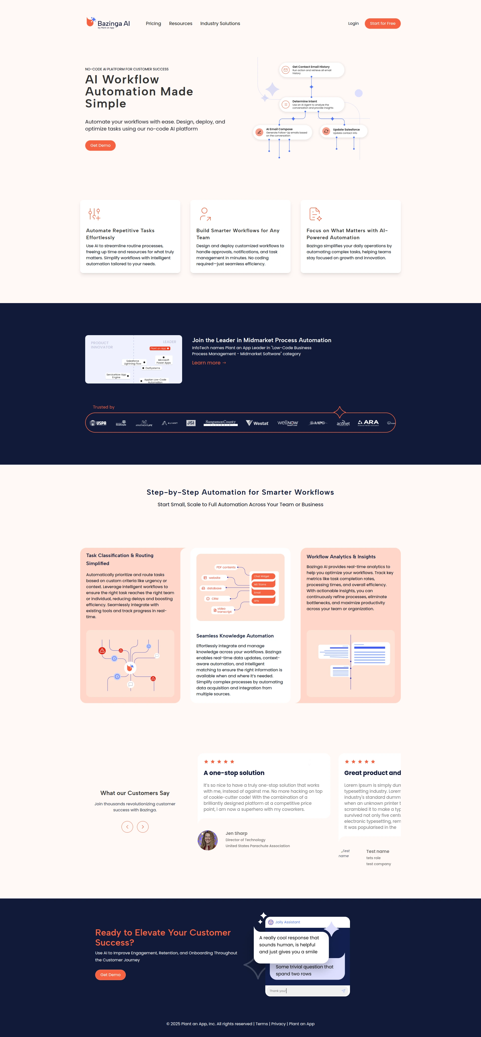
The Objective
The objective was to establish a strong and cohesive brand identity by designing a comprehensive brand book and a visually engaging website. The brand book provided clear guidelines for consistency in logo usage, typography, colors, and tone. The website was designed for both aesthetics and usability, ensuring a seamless and engaging user experience while reinforcing the brand’s identity across all digital touchpoints.
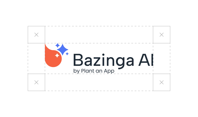
It all starts with a logo
A strong logo is simple, memorable, and versatile, ensuring it resonates with the audience across various platforms and mediums. Bazinga's logo represents a stylized chat bubble and the instantly recognizable AI magic star

Base element for the brand identity
All graphic elements are derived from the logo’s shapes, creating a unified and recognizable design across all materials. This ensures that every visual detail—whether it’s icons, buttons, or backgrounds—feels intentional and aligned with the brand’s identity. By maintaining this consistency, the brand becomes more visually cohesive, reinforcing trust and recognition while making the user experience feel polished and seamless.
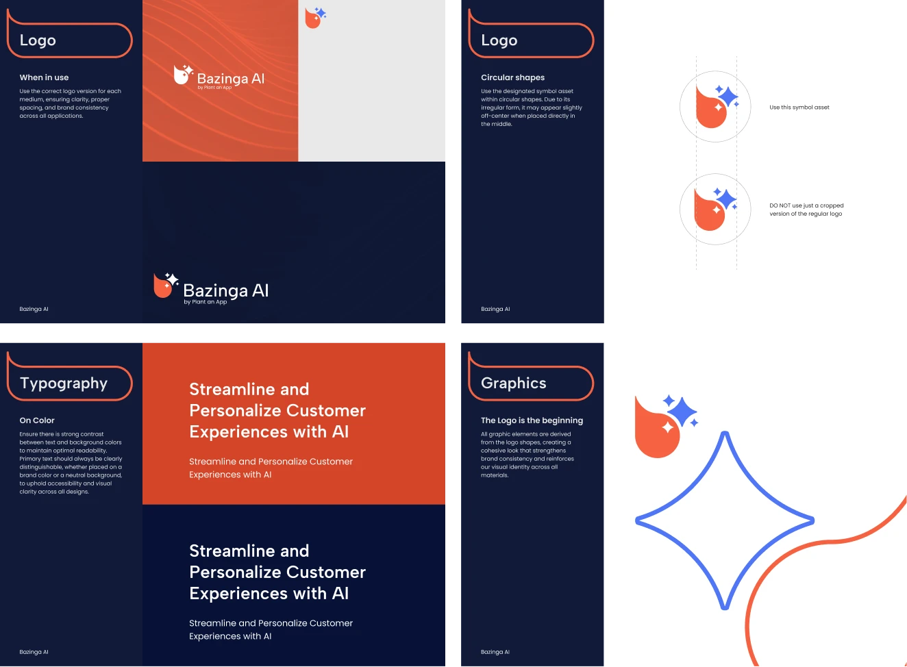
Using the logo as the baseline, I derived a cohesive and memorable styleguide
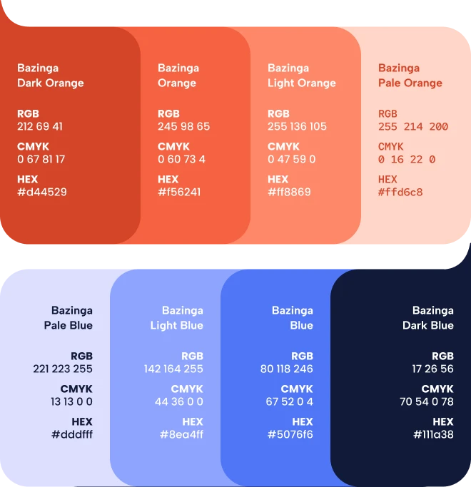
Color
I carefully crafted a color palette centered around orange and blue to make the brand feel more approachable, especially for non-tech audiences. Orange conveys energy, warmth, and creativity, while blue adds a sense of trust and professionalism—striking a perfect balance between innovation and reliability. Starting with these core colors, I systematically expanded the palette, ensuring harmony and consistency.
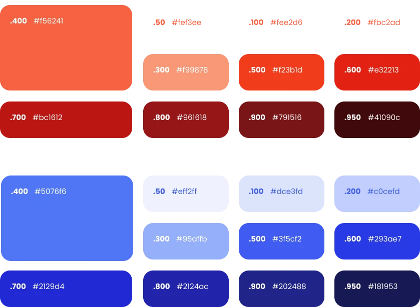
Tailwind CSS Palette
From the initial shades, I derived a comprehensive Tailwind CSS color system, defining variations for backgrounds, text, buttons, and accents. This approach provided scalability and flexibility, allowing for a visually cohesive experience across the entire platform while maintaining accessibility and contrast.

Animated elements

Expanding the style guide to UI
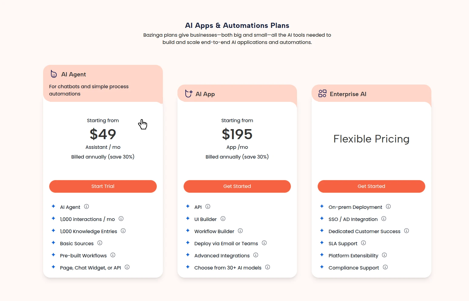
Expanding the style to UI elements
A major advantage of being both the brand designer and the UI/UX designer is the ability to create truly distinctive and cohesive user interfaces. This ensures that every element not only aligns seamlessly with the brand’s identity but also feels intentional, polished, and visually unique. By maintaining full creative control over both branding and UI/UX, I can design experiences that are not just functional, but also aesthetically compelling and instantly recognizable—giving the product a powerful competitive edge.
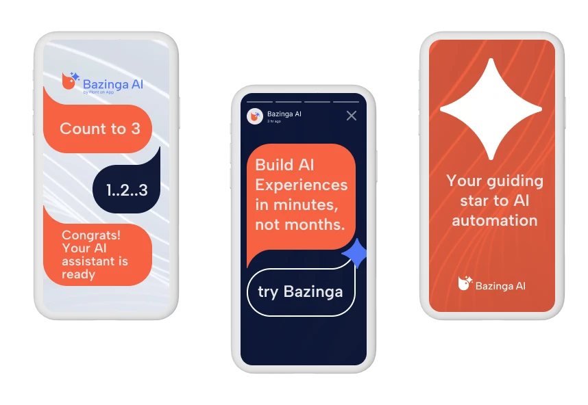

Conclusion
Got an idea for a project?
Or have any burning questions ?Shoot me an email to get started! valericiutac@gmail.com